Monday, January 29, 2018

Importance Of Colors In a Design

We know how easy it is to simply pick your favorite color and move forward with your design project. But, important thing to keep in mind is to choose the right colors for your project. Today we’re here to give you a little background on why color is important and deserves your undivided attention. The best way to learn about in-depth concepts of color theory is by joining best graphic design institutes which conducts special visual communication classes.


Some of the reasons why color theory is important?

  • They are indeed a very important part of our life. They also affect our designs to a lot of extent and carry an emotional vibe with them so when we see a color we have an emotional response towards them.
  • Not only this, every color carries a different meaning eg. warm colors show excitement, optimism, and creativity; cool colors symbolize peace, calmness, and harmony. Thus, choosing the right color is a big task. Using them in your design should have a purpose and meaning to make it better and meaningful.
  • They help a lot in communicating the message behind the design to a large extent because it draws attention and guides the eye. It thus gives a direction to your design.
  • They are used to get your design noticed and positively connect potential audience. 

Meaning of Colors

Meaning of Colors

Every color has a different meaning behind it:  

1. Yellow
It is associated with happiness, warmth and energy.We can use it for various purposes like, to produce children's product, in the items related to leisure or in the restaurant interior. However, it should be avoided if you want to represent stability and safety.
E.g.- yellow is used in sign boards since it highlights the instruction and important information. It attracts the eye thus promotes the message very well.
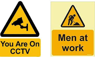

Significance of Yellow Color

2. Red

Red is the color of blood thus it signifies energy, danger, strength, desire and love.
It enhances human metabolism and raises the blood pressure. It allows a person to make quick decision and it's a perfect choice for 'buy now' button on the web.
E.g.- red is usually used with yellow by the fast food industry because it triggers stimulation, appetite and hunger. For instance, McDonald’s and KFC uses red color for their logo.

Significance of Red Color

3. Green
Green color belongs to the nature. It has a great healing power, moreover it’s the most soothing color for the human eye. It indicates growth and hope. It can be used to promote green products since it has a direct connection to nature.
E.g.- it is usually used in hospitals since it doesn't shout for attention and also gives a soothing effect.

Significance of Green Color


4. Blue
It is related to the sky therefore it's often associated with depth and stability.
It produces calming effect and slows human metabolism. It is also considered to be a masculine color and it is widely accepted among males.
E.g.- blue is the most popular color on internet. It is a comparatively modern invention which also symbolizes trust, confidence and faith.

Significance of Blue Color

5. White

It is used to represent peace and purity. It is also considered to be color of perfection. White is the color of snow therefore its used in advertising to signify coolness and cleanliness.
E.g.- it is the most desirable when it comes to cars because it denotes luxury, status and quality.

Significance of White Color

Conclusion

Thus, every color has its own meaning behind it and a designer must have proper knowledge of each one of them before using it in a design. They play a very important role in a design as they can communicate the message behind it to a large extent.

It is easy to fall back on your personal color preferences when creating your designs, but always keep in mind that your designs need to speak to your prospective audience. What colors will draw their eye? What colors best represent the message you’re trying to share? What colors consistently represent your business brand? Selection of the right colors can give a good impression and it can even make your design emerged as a remarkable work.

GDI is one of the leading institute which offers short-term graphic design course in Delhi where designers and artists can learn color psychology, color theory and design principles.

Monday, January 15, 2018

Use of Gradient in Adobe Photoshop


Adobe Photoshop is a one of best and widely known raster graphics and imaging software which was developed and published by Adobe System for Mac OS and Windows. It is available in 26 languages.

In 1988, an American scientist Thomas and John Knoll created Photoshop. This application can edit and compose a raster image in multiple layers and support different types of masks. RGB (Red, Green, Blue), CMYK (Cyan, Magenta, Yellow, Black) are color media which comes in several colors. It is generally used for graphics file formats but it also uses in PSD and PSB file formats. PSB files are large document files than PSD files. We can use it in Photographic, graphic design, video game and advertising.

Photoshop Tools 

These tools can be categorized into 6 options:
  • Drawing tools
  • Painting tools
  • Measuring and Navigation Tools
  • Selection Tools
  • Typing Tools
  • Retouching Tools

Gradient

Gradient is a smooth blending of shades. It works on light to dark or one color to another color.
By using Gradient, we can create colorful background and foreground in 2D drawing program.

Types of gradient 
 1. Linear Gradient
 2. Radical Gradient
 3. Angular Gradient
 4. Reflected Gradient
 5. Diamond Gradient
1. Linear Gradient: It mixes the colors of gradient from start color to end color in a straight line.


2. Radical Gradient:  It mixes the colors from one point to endpoint in a circular pattern.


3. Angle Gradient: It moves the colors in counter-clockwise sweep around the starting point.


4. Reflected Gradient: Reflected gradient reflects the colors in a symmetrical linear gradient on either side but linear gradient doesn’t reflect colors like Reflected gradient.


5. Diamond Gradient: It mixes the colors from middle to outer corners by forming a diamond pattern.


How to use Gradient Tool:

  • Control + N (New Page)
  • Selecting the gradient tool from toolbar


  • Go to option bar and click on open Gradient picker


  • Select a Gradient


  •                              


    • Then select the gradient type (Linear, Radial, Angle, Reflected, Diamond)
    • Click the first point and move your mouse in any direction
     

    How to load Gradient:

    • Control + N (New page)

     
    • Select gradient tool from toolbar
    • Click on gradient picker
    • Then go to Google and search any gradient
    • Save this gradient in any file
    •  Load gradient 


    • After doing this, your new gradient will be loaded in Gradient file.  


    How to save Gradient:

    • Control +N
    • Select on gradient tool from toolbar
    • Then go to option bar and click on gradient picker
    • New click


    • Make a new gradient according to   color and opacity


    • And then save click


    Gradients are known as the slow and gradual changes which occurs in a color or tint that sweep over an image or a portion of an image. They can be used to add subtle color changes to an image, such as those caused by shadow. They can also be layered and blended to create interesting effects. 

    If you are a beginner who want to learn right skills for image editing in Photoshop or a professional who wants to updated their skill set, then join Adobe Photoshop Courses in Delhi by one of the Best Photoshop Institute in Rohini. It is a 2 months short-term certificate course which will give you hands-on experience on photo retouching, image editing, text effects, cut-outs, patterns, background designing, image manipulations, and layouting. It is also available in both online and classroom mode.

    Thursday, December 7, 2017

    Layer Mask in Photoshop

    Before we start and the directly go to the layer mask, first we need to know in brief that how Photoshop work or we can say what are the things which is required for photoshop working. Photoshop which is an essential application to create designs and edit the images to make the digital world creative.
    One of the most important feature of Photoshop is the possibility to modify the same object again and again and, if you’re not satisfied, go back and return to the original image. I am not talking about the history timeline (ctrl+Z), that allows you to eliminate the last steps, but of some functionalities that allow you to have full control on your layers at any time during your workflow. Layer masks represent one of these functionalities. There are many institutes which offer adobe photoshop courses in north Delhi. Joining these short-term certificate courses will not only enhance your artistic skills, but you will be able to learn photo manipulation techniques at advanced level.

    What is a Layer?

    Layers are one of Photoshop’s most powerful features as they are individual slices of information that can be stacked or moved to create your image composition. Using layers, one can draw, edit, paste, and reposition elements on one layer without disturbing the others.

    What is a Mask? 

    A mask is a technique to apply something to a very specific portion of an image. There are two primary types of masks: clipping masks and layer masks. These two tools are closely related in concept but very different in application. Let’s start by discussing layers masks, which are generally what people are referring to when you hear them discuss Photoshop masking.

    What is Layer Mask?

    A layer mask is something that you apply to a given layer to control the transparency of that particular layer. Layer opacity controls the transparency of the entire layer at once, a mask gives you more precise controls over very specific areas. If you want the entire layer to be at 40%, you would lower the opacity, if you want just the left side of a layer to be at 40%, you would use a mask.

    We always do not want to make adjustment in the entire image so in this case, we can use the layer mask. This is a non-destructive technique which provide to edit/ adjust an image without touching the original layer. we generally create a mask layer of the original image and make our changes and adjustments on that. This method is useful when we need to reverse our changes.

    For example, when we use an eraser tool to erase something from the layer and after erasing when we close the image this then we will be not able to recover the portion which we had erased. In the layer mask we can go back at any time and edit/adjust any part of the masked layer. We also can disable the layer mask to see the image in the original stage.

    There are three colour options in the layer mask:
    1)    White:- when the layer mask is white the original layer will be visible.
    2)    Black:- when the layer mask  is black the original layer be not visible.
    3)    Grey:-  when the layer mask is grey the original layer will be transparent

    Hope you have understood how masks work. To sum up, there are two primary types of masks in Photoshop: layer masks and clipping masks. In layer masks, values of grey are used to assign levels of transparency to specific portions of a layer or group of layers while clipping masks use the transparency of one layer to define that of a different layer or group of layers. Also, while masking in simple in concept, the actual art takes considerable time, joining adobe photoshop courses in delhi and practice to master. To master the art of masking and learn latest techniques it is advisable to join adobe photoshop course training institute in delhi.

    Monday, December 4, 2017

    Use of Artboard in Adobe Illustrator

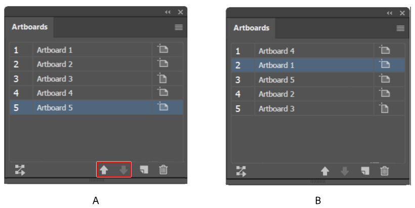
    We reach to a final design after a while before that we work on many ideas and designs. So, we need multiple pages or canvases to work on at a time in a document which are known as Artboards in Illustrator.

    In Adobe Illustrator, artboards help in the design process by organize your artwork. It helps to create a unique, attractive, and different design. Multiple artworks can be created using it in one Illustrator document. When we choose artboards, we can choose different sizes and can create our own custom shapes for our works. It is a paper which is printable and it gives us a space for doing our illustrations.

    In illustrator, we can use 1 to 1000 artboards as per our need. You can provide all the settings for the artboards while you are creating your document such as number of artboards you need, sizes, dimensions etc.

    Later you can add and delete too if you require so.

    Features of Artboards                                       
    artboard-option-in-illustrator

    We can rearrange artboards in many ways; such as:
    1.    Column and Rows
    2.    Horizontal and Vertical
    3.    Different Default Sizes
    4.    Number of Artboards etc.

    How to Create Artboards?

    1.    For creating custom artboards first select an Artboard Tool from the Toolbar and choose the predefined sizes and location of artboards. 
    2.    To adjust the artboards, select artboards tool in toolbox then double click on tool. When we click on artboard tool a dialog box open then we select options and change it according to our need.
    multiple-artboards-in-illustrator


    3.    We can also change artboards with selecting artboards tool and place it at any position wherever you want.
    adobe-illustrator-courses-in-rohini
    4.    For duplicating an existing artboard, we can go to toolbox. Select artboard tool from there and we will get some options in options bar and can change numbers of artboards in options panel. 
    5.    We can also create duplicate artboards along the content, press Alt command and drag the already created artboards while Artboard Tool is selected.

    Exporting Artboards

    We can change artboards in other file formats with export file setup in options. 

    1.    For creating a file or work in other file formats like jpeg, tiff, png go to File option and when options will open, select file export options and then select the desired artboard which you want to convert, in case you are working on multiple artboards.
    2.    This option is very helpful for us because when we change file formats with the use of this option, we can open our file in other software and see our work in different style.

    I think artboards are an important part in the graphic designing. It is a place which gives us space for doing our work and make a content printable, readable and it is the base of design. While creating artboards, you can choose from a wide variety of predefined sizes or define your own custom artboard size.

    Are you looking for Adobe Illustrator Training Course Institutes in Delhi which can guide you to use the Artboard Tool within Adobe Illustrator? If yes, then Graphic Design Institute offers Adobe Illustrator Courses in Delhi which will train you all practical aspects of the application. Whether you're new to Adobe's popular vector graphics editing software or a seasoned professional just looking to better acquaint yourself with the program and its various features and filters, you're sure to be well served by joining best graphic design institutes in Rohini. For more information, please call 98118 18122.

    Thursday, November 30, 2017

    Step by Step Poster Designing in CorelDRAW

    Poster is designed on printed paper. It includes both textual and graphic elements. But poster can be designed using both solely graphics or text. It is different than any other design. They are basically used for advertisement of any company or event to communicate messages. Poster designing is quite a bit different than any other design piece that may be done. There is not one way to design them. They offer the freedom to design that no other document design can. These guidelines can really open the possibilities to show creativity in the process.
    If you are pursuing graphic design courses in Delhi and trying to make a poster, so CorelDRAW is best option available.

    First thing that you should know is that your poster should be very eye-catching and informative. Secondly, it should get the attention and serve the purpose.

    So now here are some points you need to know before designing a poster in CorelDRAW:


    1. First of all, you should prepare the design brief with your client so that you can understand the design objective. 
    2. Then collect the required content for poster such as logo, brand name, date, website, and other important information. 
    3. Then choose the grid system, layout, and color scheme for your poster. If you have logo of company or event for which you are designing poster, so choose the color scheme according to logo.
    4. Then you should prepare at least 4 Thumbnail Sketches or Idea Layouts which will demonstrate your ideas for that.
    5. Pick 1 or 2 best thumbnails and add detail to them to make your Rough Layouts. Colors can be used for detailing purposes.
    6. Pick one best from the Rough Layout and add the high-level detailing to create the Finished Layout.
    7. Then open up your CorelDraw and convert your Finished Layout to the Digital design.
    Note: For planning all above explained topics you need to attend training from a dedicated CorelDraw Training Institute as this can't be learnt without the instructor. Yet I am giving some points to explore by you if you can. 
           1. Visual Grammar
           2. Drawing and Sketching with all the possible media and mediums
           3. Strong knowledge of computer designing software


    Now once all the above-mentioned steps are done, you can start designing digitally. There are different things you can use in CorelDRAW for making a poster.
     

    You can use shapes combined with fountain fills, drop shadows that can give outer glow or shadow to your graphic or text, then with the help of blend tool, custom pattern fills, various blending modes can be applied and original images can be added as per the requirements from the company or event.
     

    What I designed in CorelDraw once, want to share with you here so giving you some points to design in CorelDraw below:
    1. First of all, we will open a new document and set the name of poster and the standard page size. For example, here we are designing a poster for yoga studio.
    2. We will set the background, choose a rectangle shape and then you can choose fountain fill for color and blending modes. You can also select the triadic color scheme like orange, yellow and green.
    3. Now take a rectangle tool same as your page size and choose fountain fill or you can also make rays through shape tool. Again, take a rectangle tool and make thin long boxes, copy them and rotate it.
    4. Now fill the color according to logo or color scheme. Then as background is set, choose the image of yoga pose and set in the center. I have chosen silhouette image. You can also use drop shadow on your image if needed.
    5. If you have chosen silhouette image you can place your punch line on the image but if you have chosen the image of a model, then you can place your punchline in the bottom. Place your logo on right or left side.
    6. Event information, website name, phone number or any other information will come at the bottom.
    After all the above steps are done your poster will be completed. We hope you found this tutorial on “how to make a poster” helpful and we would love to hear your feedback in the comments section below. Don’t forget to show us what you’ve learned by sharing your photos and creative projects with us.  In case, you would like to learn short-term certificate course in CorelDraw, then learn this tool by joining classes for CorelDraw in Delhi which is recommended for every designer who wants to benefit from its features like increased speed, accurate color control, improved vector illustration tools, and additional design capabilities.   

    Thursday, November 23, 2017

    Best Training Institute for Short-term Graphic Design Courses in Delhi

    The high-tech world has provided us with continual education and employment opportunities these days, and one such great avenue is graphic design. Surrounded with a profusion of career options, to pursue the right course become a challenging task for the aspirants. Graphic Designing is an upcoming career options and is much in demand today. It offers much scope for students to either start working in an MNC or work as a freelancer. The courses offered by graphic design institutes will help individuals learn basics and get onto advanced levels like understanding the images, words, symbols, and letters that are the main means of communication in the field.

    What is Graphic Designing?

    Graphic designing is an art or a process of solving problems/ objectives visually by images, texts, videos. In simple words, it helps us to visually represent ideas and messages: like in the form of images and text. In today’s digital world, the graphic designing has become the mainstay of all the media vehicles which includes the digital media, motion animation, product design, packaging, information signs etc.

    What are Short-term Certification Courses?

    Short-term courses are those courses that can be completed in a small period of time say between 1 -6 months. These types of courses are very beneficial for working professionals, intellectuals and students who have a busy schedule they don't have so much time for long-term diploma courses. That's why they like to go through a short learning process.

    Why Selection of the Right Institute is Essential?

    Opting for the right Graphic Design Institute can really make a huge difference in your career. A good career lies in good education only, and once you have the right base, the sky is the limit. Going for a reputed institute will not only make you theoretically sound but practically also, which is far more important in this field. Apart from this, the training from the experts from this field, placements and industrial training are some of the other advantages which you can avail by going for a best graphic design institute.

    Short-term Courses in Graphic Design at GDI.

    GDI is the educational partners of ADMEC and considered as one best graphic design institutes in Delhi offering highly advanced short-term certificate courses. These short terms graphic design course in Delhi are appropriate for working individuals, who wish to enhance their existing career prospects or any student to pursue her hobby. These courses are the simplest and quickest way of learning specialized modules as per the needs of different individuals. Some of the courses offered by GDI are:
    ·      Graphic Design Standard Course
    ·      Photo Editing Master course
    ·      Adobe Photoshop Master Course
    ·      Advanced CorelDRAW training
    ·      Adobe Illustrator course
    ·      Adobe InDesign course
    ·      QuarkXPress course

    Graphic designing is for those individuals who are passionate and creative by nature. They carry a lot of responsibility of brand awareness. It stands behind the success of any marketing or advertising campaigns. It is such a powerful means that it can create a mental image and positioning of the product in the minds of the potential customers or audience. Graphic design courses will make you familiar with the world of different graphic images which include logos, photos graphic text headings, background images etc. So, it is better to weigh all the options available and choose the best one for you.